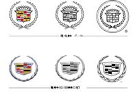
In 1998, when Cadillac began creating a new design language for its models called “art and science,” graphic designer Anne-Marie LaVerge-Webb of GM’s corporate and brand identity group was called on to rethink the Cadillac emblem. The new design theme (fig. 2) aimed to combine suggestions of high technology and elegance through faceted shapes—inspired by the stealth fighter and by gemstones. LaVerge-Webb, a graduate of CCS in Detroit had come from an ad agency. She reviewed the history of the Cadillac emblem, which had appeared in many variatons over the years.
The designers, she said, reviewed dozens of emblems from grilles and trunks throughout Cadillac history, including rare items in a special collection kept in a drawer in the design studio in Warren. “The big question was whether the change would be evolutionary or revolutionary,” she said. She describes the choice as evolutionary, but it seems more dramatic than that.
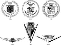
The original Cadillac logo (fig. 1) is based on the family crest of the man for whom the company was named, the Gascon officer and minor aristocrat who founded Detroit in 1701—Antoine de La Mothe, Sieur de Cadillac. His coat of arms, like many family coats of arms, appears to have been concocted and borrowed from a more noble neighbor. This may be appropriate for a car that has often appealed to the self-made man—if the not the nouveau riche hustler.
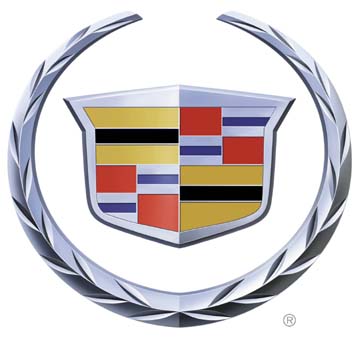
For the new logo, however, there was a need to match a new body theme. Cadillac’s top designers and Wayne Cherry, head of all GM design, were involved. “Wayne wanted to be sure the logo looked like an essential part of the grille, not something tacked on,” LaVerge-Webb said. The new look of the cars was to be high tech, a “milled from solid metal” look. The group decided on a major changes to the traditional crest and wreath emblem. The new "Wreath & Crest" logo was unveiled at the 1999 Pebble Beach Concours d’Elegance, where collectors and designers assemble to appreciate collector cars. The shield wore the colors from Cadillac tradition: red, silver and blue, black and gold on a platinum background, aimed to suggest high technology. But the pearl-topped crown was gone as were the merlettes or ducks from the coat of arms of the original nobleman. The wreath was to be faceted, too, its leaves reinterpreted in a mechanical form.
The result suggested a Mondrian.
The “merlettes” or ducks had been used in an infamous ad campaign for the small Cadillac Catera, billed as “the Cadillac that zigs instead of zags.” One duck was seen swimming in the direction opposite the others. But on the new logo the merlettes were gone; many saw the ducks as collateral casualties of the failure of the Catera.
“We wanted to make it less fussy, more technical. The look we were aiming for was the milled out of a single billet of aluminum. The ducks felt fussy,” she said. Furthering the high tech theme, the typeface for model designations is a handdrawn and modified version of Serpentine.
Removing the crown was also read by some as a quiet abandonment of Cadillac’s long time proud motto, “The standard of the world,” a claim no longer supported by sales, quality or customer satisfaction ratings. Beyond the hundreds of drawings for the new logo, considerations of materials and manufacturing took over. Even a few pennies of cost figure in acceptance of logo designs as in all parts of the auto industry, where costs are multiplied over millions of cars. The physical logos and other graphics are tested extensively over two years for endurance to heat, cold, and salt damage.
Stereolithography is used to produce models for visual testing for size: proportion of the logo to body shape and position is critical. Logo sizes and shapes vary according the vehicle of course: the current Escalade SUV and truck wears the largest Cadillac logo ever. It is known internally as “the frisbee.” Cadillac recently introduced the high performance CTS-V model, with a Corvette engine. It is the first of a new “V” line whose logo (fig. 3) squeezes and angles the colors of the basic crest so they suggest a racing flag and attaches them to a V evoking V shaped engines. The V is tilted as if with speed. The logo for V-Series models employs the same basic elements. But according to Kip Wasenko, design director, GM Performance Division, who oversaw the design of the V-Series logo.”While its colors are meant to depict the ’luxury’ side of Cadillac, its vertical orientation and its forward-leaning angle to the right are both meant to depict motion and performance.”


